A Journey to the Center of the Earth
This hybrid narrative adaptation is comprised of 364 illustrated and designed pages to immerse readers in the original A Journey to the Center of the Earth classic novel.

Project
Specifications
Thesis (6"x9" Book)
Time Spent: 6 months
Software: InDesign, Illustrator, Photoshop, Procreate
Type Choice
I first started with basic fonts to figure out the layout and came up with two possibilities.
Then I started to look into more interesting fonts to fit the book. Originally, I was looking at medieval fonts, but realized it looked nice, but didn't fit with the book. The entire adventure of the book begins with a runic code, which began my search for runic typefaces. I found one that nestled the words well into each other and fit the book perfectly.
I then realized the translation I used for the book itself used the title A Journey to the Center of the Earth. With the new realization, I worked to incorporate the "A" into what I already had.

Cover Design


In determining what to put on the cover I had a brainstorming session where I drew and wrote anything that came to mind when I thought of A Journey to the Center of the Earth. Using this page I began sketching out ideas for the cover.
Compasses are essential in all of Jules Verne's novels and from the beginning, I wanted to incorporate the compass into the "O" of Journey. That was the first step in compiling the cover. Next, I took what I drew in the sketches and started planning a composition. Snaeffel is where the journey begins and I wanted that to be the cover. The shadow of the sun points the way to the center of the earth so the positioning of the compass is meant to represent the sun.
The main critique I was getting when I started to create this cover was that it wasn't telling the story. I read the book multiple times and I thought it was perfect. It showcased how the journey began. However, many people don't think of how it began, they think of the battle of the two prehistoric sea creatures: Plesiosaurus and Ichthyosaurus. This iconic scene is illustrated in many renditions of previous book covers. When I began incorporating this battle it created the perfect transition of how the story begins and when they achieve the center of the earth.


Research & Page Layouts
What is a hybrid narrative?
A hybrid narrative is when a story changes either perspective or writing style. It can also mean bringing elements of the story out on the page to be more realistic. If there is an email or text message, it gets formatted to look exactly like an email or text. If it's a page from a book it is shown as a book inside the book.
My main inspiration and references for creating this book were The Illuminae Files by Amie Kaufman and Jay Kristoff, Bats of the Republic by Zachary Thomas Dodson, and House of Leaves by Mark Z. Danielewski.

Research

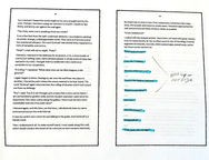
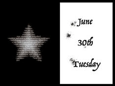
I printed a pdf version of A Journey to the Center of the Earth to fully plan out the book. I started with color-coding by dates and locations. I wanted the chapter breaks to be the days instead of the original chapter breaks to help this new layout flow sensibly. I also wanted to map out the journey as it was happening to provide a visual of how far they have traveled.
Then I went through again and made notes of what I could do at each part. These notes included how to lay out the text, illustration ideas, and physical elements to come to life.
Tea and Coffee Staining


For most of the physical elements shown in the book, I printed and stained myself using a mixture of tea and coffee. I also used hot chocolate to achieve a medium darkness stain. For the runic one, I burned the edges for a more organic and older look than the rest.
Shaft Pages
This part of the book is when the characters are going down the verticle shaft on a rope. This layout forces the reader to turn the book sideways and keep reading downward as if they are going down the shaft with the characters.

The Ship's Log
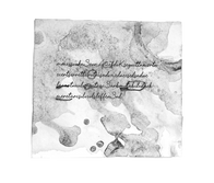
There's a part of the book where Axel takes over writing in the log book. They call it the Ship's Log. For this part, I bought a leather-bound journal and soaked it in a light tea to give it a rough and aged look. Then I went to a couple of pages in the journal and added stains to the individual pages.
I scanned these pages and used a script typeface to make them look handwritten. I laid out the type and added the illustrations. Then I took the pages into Photoshop and added subtle blurs to the text in areas to give it a smudged watered-down feel. In the end, when the words became unreadable and cut off I added ink splatters.


Talking Miles Apart
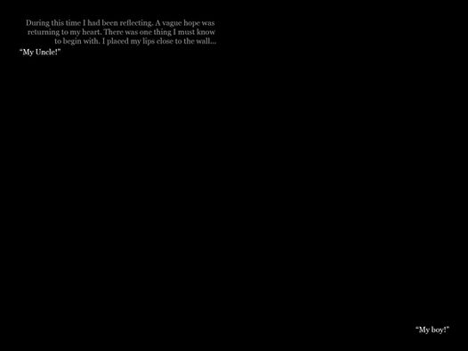
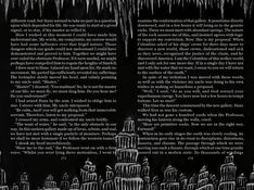
In one part of the book Axel gets lost from Professor Leidenbrock and they discover an acoustic phenomenon where they can hear each other when they are four miles apart. To achieve this I separated each side of the conversation so that as someone is reading they experience the delay the characters are experiencing.
Illustrations

Other Page Spreads


